Friday 30 October 2009

Pete Character Design

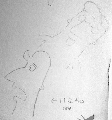
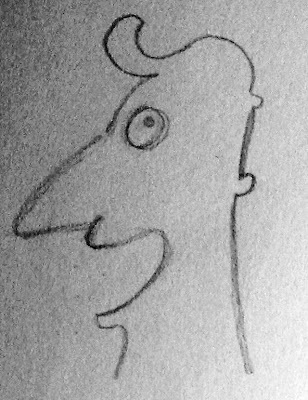
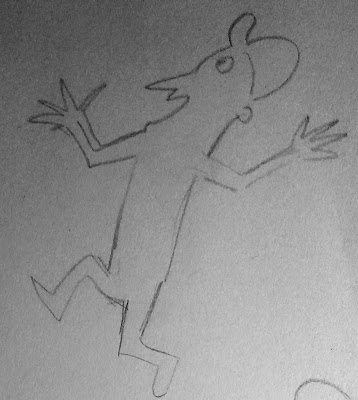
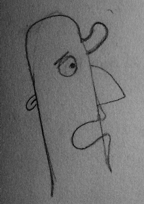
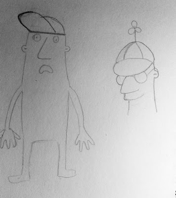
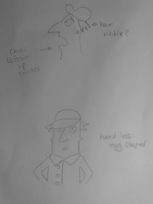
Here are some preliminary character designs for Pete the Pet-Sitter (apologies for the quality, I'll be sure to use a scanner next time).


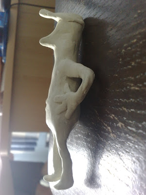
I also modeled a combination of the previous drawings using plasticine so it could help me visualise Pete's body from all angles.
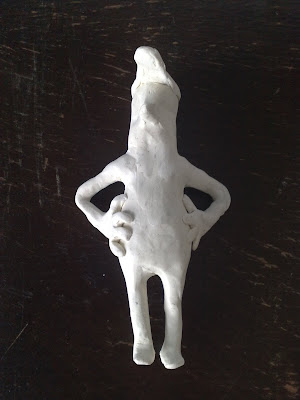


I then Traced the shape in illustrator to get a clear, in proportion front and side view
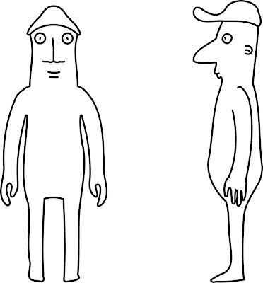


I'm still not happy with the design though, I believe some tweaking is in order...

Thursday 29 October 2009

More references

Screenshots of characters from Disney's short Toot, Whistle, Plunk and Boom.


Background design for When Magoo Flew (1954, UPA).


TV commercial for Renault (ca. 1960, Pantomime Pictures)


tv commercial for Hills Bros. Coffee 1958


Another commercial for Hills Bros. Coffee 1955


Tv commercial for Amoco 1955


The World Beneath Us (1955, Disney)


Model sheet for an alien character by Sterling Sturtevant

man and the moon 1955, disney


Christopher Crumpet’s Playmate (1955, UPA)

Wednesday 28 October 2009

Pete the pet sitter references

Ed Benedict

Ed was an American animator and layout artist best known for his work with Hanna Barbera. He helped design Fred Flintstone!

I love the style of his characters, the large noses on adult males that is typical of the 50's, short, stumpy characters with over sized heads, seamless head-neck-shoulder lines, quite angular mouths and simple primitive shapes.


An early design for the Flintstone family


Toot, Whistle, Plunk and Boom


I love this Disney short from 1953. Every frame has beautiful composition with a mix of simple geometric shapes to get across a variety of different ideas. The character designs are spot on too, I'd like to take some inspiration from these and other 50's character designs for the design of Pete the pet sitter.

Tuesday 27 October 2009

Revised Animatic

I realised that the storyboard I had would be far to long and hard to accomplish to a good standard. I've revised the story, taking out the pet shop scene entirely. I extended the chase scene to the sort of length i originally envisioned.

I looked at a lot of Scooby Doo cartoons for ideas when it comes to being chased around a big mansion. I also tried to keep things abstract, at one point they just run along a line, at another, you can only see their footprints. I experimented with colour for the chase scene, hopefully highlighting the action and perceived danger. I made a couple of mood boards, which helped me a lot when it came to visualising the scenes.

The actual owner of the baboon is irrelevant. Instead, meet Pete the pet sitter. Arriving at the big mansion to look after a pet baboon (who knows his way around his haunt quite well...)


Thursday 22 October 2009

Influences mood board

I created a mood board based on the influences in the post below.
Click to enlarge.


Chase scene style ideas

For the majority of the Chase scene, I plan to use flash instead of Maya, to save time and to give a stylised, abstract look to the action and the location, much in the style of Catch Me If You Can. I've been looking around for other influences too. A good place to look is opening/ ending title sequences for films, where the action of the film is abstracted and summarised.


Monsters inc. opening credits.


Catch me if you can, opening credits


Kiss Kiss Bang Bang


I like Saul Bass's graphic design with the clear shapes, bold colours and un-cluttered scenes. He did a lot of title sequences, like this one (It's a Mad Mad Mad Mad World):


I also like the flow of the 'Edifice Sequence' from Saul Bass' Why Man Creates. It got me thinking that for the chase scene, perhaps I could have one background that just pans around while the characters move on it. Perhaps a big mansion with lots of intresting rooms (if the man can buy a baboon, he surely must be faily wealthy!)

Wednesday 21 October 2009

How to tell a joke

At the moment, I think my storyboard is far too long for the amount of time I have. I need to cut out anything unnecessary and keep in only what I need to get the point across. I read this article on how to tell a joke and found the folowing steps apply to my story the most:

#5 There must be ample set-up to the joke, providing the pertinent details the audience needs to know.

#6 There must be a punch line or strong conclusion.

#7 When in doubt, the shortest distance through Step #5 and onto #6 is usually best.

#8 Avoid detours. As a rule, jokes work best in a straight line.


Based on these principle steps, I can break my story down into 3 crucial parts giving me the principle three act structure.

Set up/ Begining:
  • Man buys a baboon, is told not to touch it.
Middle:
  • Man touches baboon anyway
  • Baboon goes crazy and chases the man
Punch line/ End:
  • Baboon catches man and touches him back, says "Tag you're it"

Each part is crucial to a good joke and a good story. Without the set up, the punch line would make no sense, without the middle, the story would not flow, without the end, it wouldn't be funny.

Tuesday 20 October 2009

Storyboard so far

There is still a lot of editing to do here. Scenes to add (chase scenes), scenes to shorten (everything else)... But you get the general story idea.


Baboon character Design

Pastel shape-play


How the baboon might run


I like the curves in this one


different shaped baboons


I liked these two drawings so decided to make a maquette so I could visualise it from all angles


Wire skeleton


I like the back, the butt and the legs


I may need to make the arms a little thinner at the top so it looks less gorrilla-like and more like a baboon


Hands could do with being a little smaller

Not too keen on the nose, too long and curved. Also the eyes need to be more inset, the brow heavier.


I will use these as the basis for my image planes for Maya but alter the nose, the brow, the hands and the arms


I also want to give him spikey hair, like in my first paper cut-outs. I like the brow in these too.